The only thing I would point out is tiling wood texture. But it's still ok. :)
For me it is always awesome how you achieve realistic and aesthetic results with very simple means and (almost?) no fakery.
If you are ok with sharing your secrets - could you post screens of your material setup for the outside wood, water and glass?
You are very right about tiling :- ) and I was aware about this..but sometimes, I just say "ah, whatever" and just move on. I haven't changed the material from original commercial version, and that one was built in 7 days.
Yes, I'll post the screenshots, but you are again correct it will be super simple. I am simple person, so don't expect som sofistication in them :- )
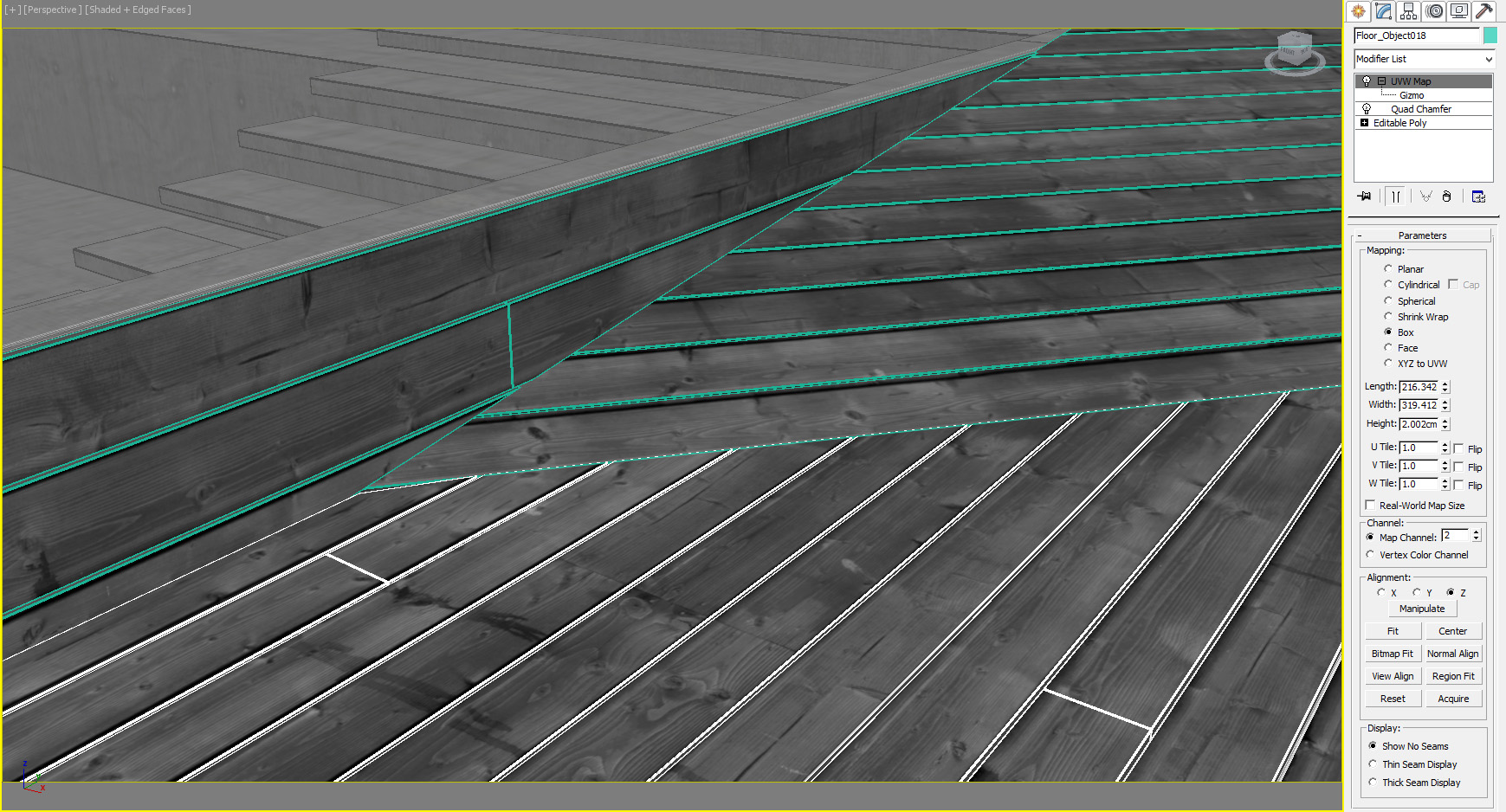
First screenshot shows that the geometry is not displaced or anything, but each plank is modelled and chamfered using QuadChamfer. Every single object has chamfers from this :- ) It is then mapped through 2 different UVW channels for the above posted maps.
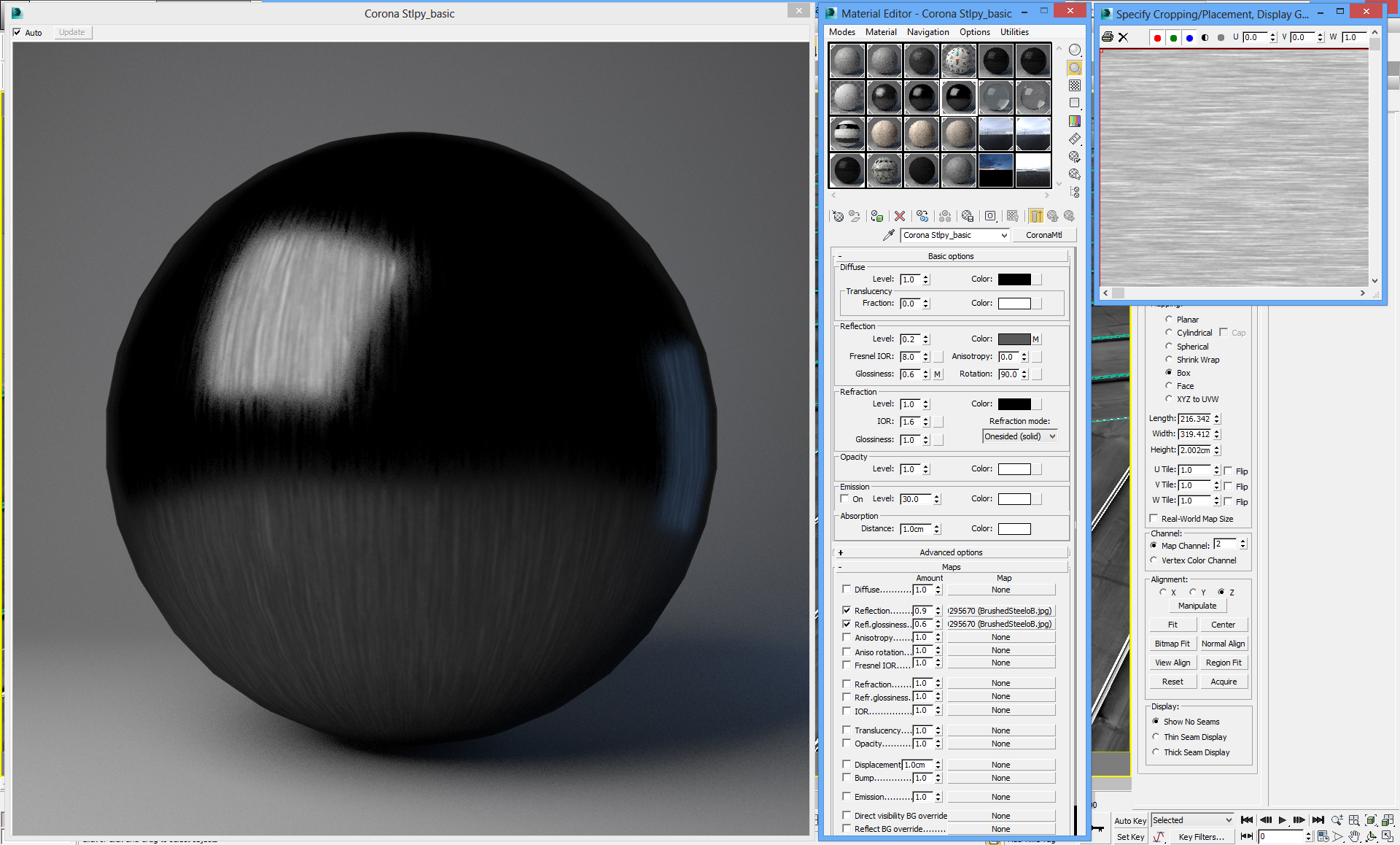
Here is material screenshot, nothing special. Maybe worth noted for some, is that I often use anisotrophy for woods. Make of it what you wish but I like the results ;- )

Glass. Nothing to watch :- ) Embarassingly simple. I am pretty sure more complex glass can be made, but, this one works. This project originally had double paned glass, but I didn't particulary like the look this time, so I simplified it back to single box of 12mm thickness. There is no bump for distortions :- ) I usually use it (and it is painted not noise), but this time again, I simplified it for most clarity into interiors. Hybrid glass, although I think I tried rendering with true glass as well and it went just fine, maybe because there are so many windows.

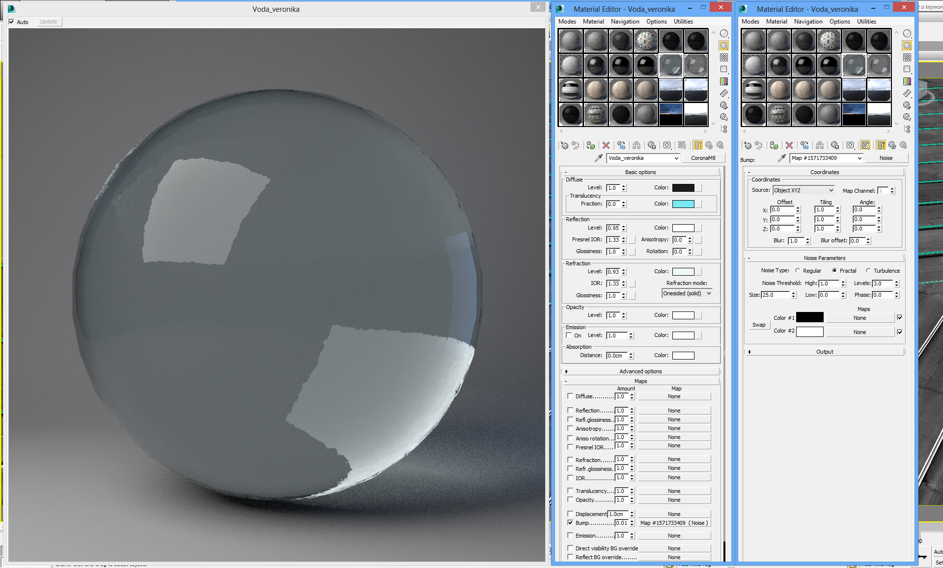
Water. The difference is IOR and small noise bump. Again, nothing nested or interesting. It worked and I was satisfied. True refraction this time, not hybrid.
Since I already opened up the scene, I might as well post the other ones in case for later.
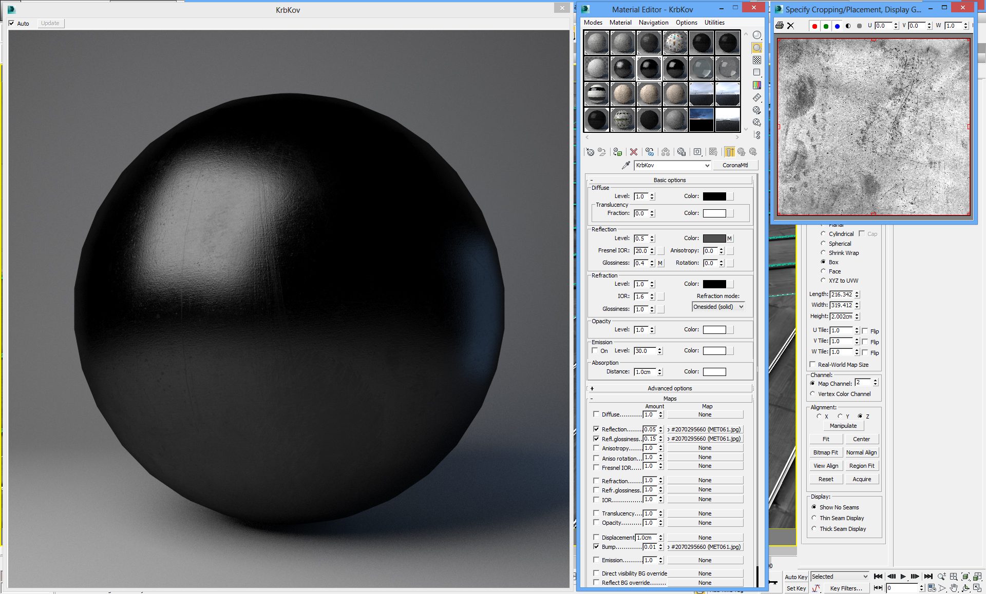
Metals: Even more simple..just one texture. But what I consider important, is they are pure black in diffuse, there is not texture or value there. That keeps it pretty autenthic.
The windows: It looks weird on preview because it was properly stretched by UVmapping on objects ( on Z-axis)
The fireplace Top Part : I quite like this one, the texture is simple composite from some scratches from cgtextures. Unusually, it features bump map as well, something I avoid most of the time.
THe fireplace Lower Part: It ended up not being visible, but I still quite like it. Here I contradict myself, because I ended up using very small diffuse value through map, this material is more "composite" than true metal.

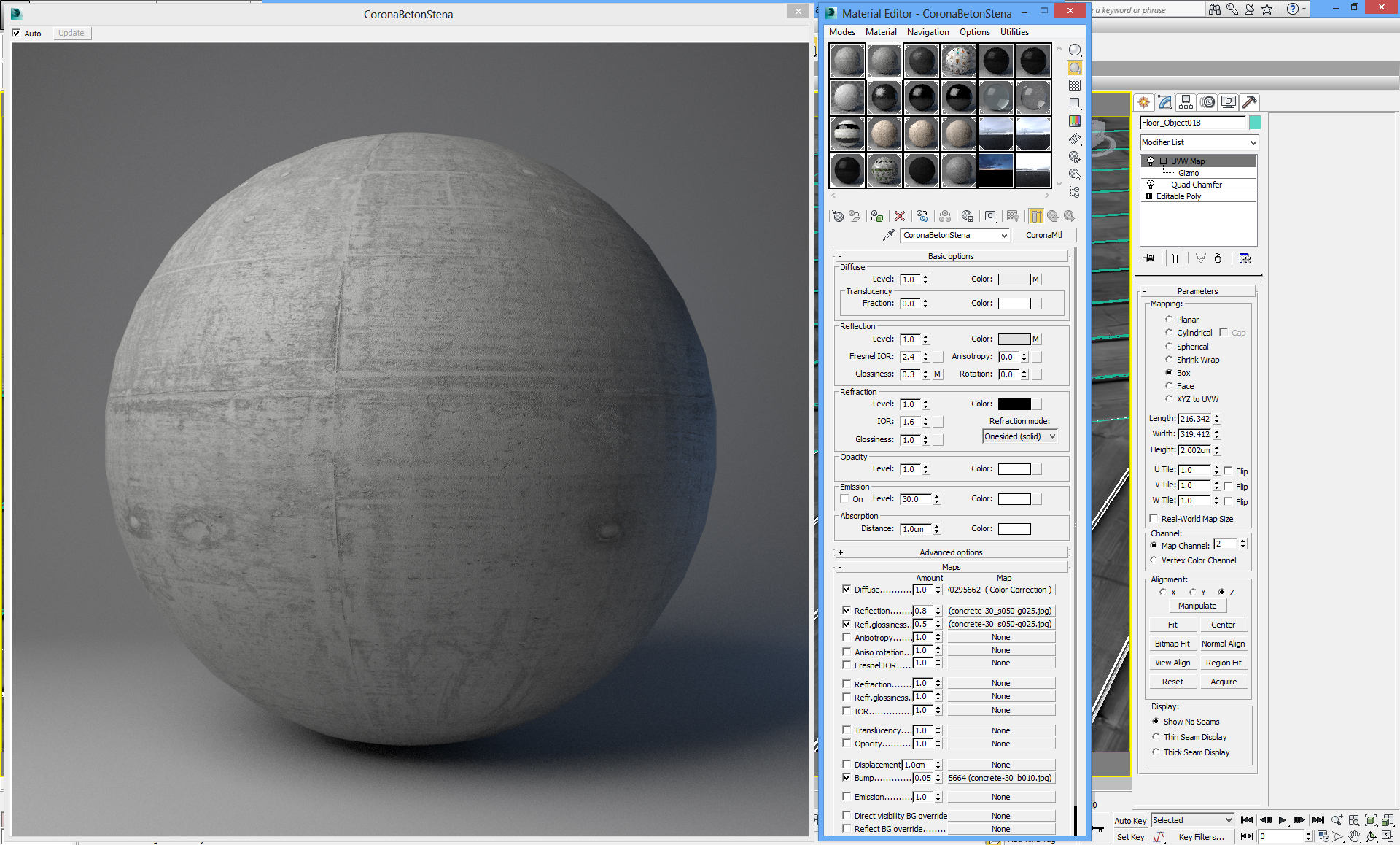
Concrete: Again, very very basic. I used unmodified Arroway textures. I got some flack for tiling pattern, which is not true, because they tile on 5meters :- ) but the texture itself seems so. I
agree the some Arroway collections, while extremely high in quality, can have certain generic/plastic feeling about them. But it's impossible to find something in same quality unless you photograph it yourself. Only thing worth mentioning, I sometimes uses higher IOR for concrete as it is composite material so it becomes more reflective, but very matte-glossy, almost unnoticeable unless extremely grazing angle.
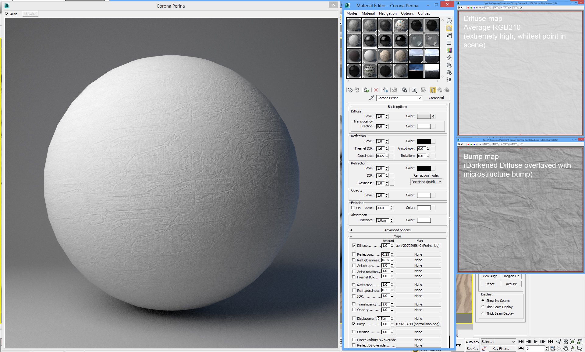
Bed fabric: Extremely simple. At some point, I had variant with displace, then normal map, but in the end I settled for simple bump map. Works wonders :- ) I would like to point out this is the
brightest material in whole scene, with RGB level 210!, every other white is between 160-180 RGB including white paint.
I hope no one will scrutiny me for this :- ) I ain't no Bertrand, I have very little time and when I can do things simple, I keep it simple.


