Author Topic: First renders - Paris apartment early previews  (Read 43288 times)

2013-06-09, 18:11:16
Reply #30

Juraj

  • Active Users
  • **
  • Posts: 4765
    • View Profile
    • studio website


Sorry sorry, I digress :- ) Burnt, and low-light is requested by client, and I love strong burnouts too :- ) They bring life.

Here is example of her work and photography. But maybe I overdid it ? It's tough balance..


That said, I will try it. But since the output is fully unclamped, is there reason not to do it in post ? I do not liked colormapping in Vray much, and kept it fully linear with adaptation to adjust light balance in MagicBullet.

Thank you Michal for advice
« Last Edit: 2013-06-09, 19:25:41 by Juraj_Talcik »
Please follow my new Instagram for latest projects, tips&tricks, short video tutorials and free models
Behance  Probably best updated portfolio of my work
lysfaere.com Please check the new stuff!

2013-06-09, 18:15:46
Reply #31

Ludvik Koutny

  • VIP
  • Active Users
  • ***
  • Posts: 2557
  • Just another user
    • View Profile
    • My Portfolio
The interior on that photo is a bit darker than yours, so naturally there is a bit more contrast, and it even seems to be exaggerated in post. In case of you renders, the white burn is the first thing that comes to mind as wrong, when i look at the renders ;)

2013-06-09, 18:17:31
Reply #32

Juraj

  • Active Users
  • **
  • Posts: 4765
    • View Profile
    • studio website
The burn is very controversial thing and is a lot taste-based. I don't want to excuse myself it's indeed too much :- D But I do I prefer it a lot, even if it comes across wrong for quite most people.

My biggest inspiration is Yellows photography. http://yellows.dk/ It's one of the most high-end scandinavian interior photographers, and I am very jealous of their work and would love to attain similar level one day in digital domain.


Just trying to explain :- D All in good faith, I do write down the opinions :- ) And value them guys


Rawa, mine is modified in post too :- ) It's not that overburn in Corona Framebuffer. I have difuse glow, and strong softlight in PS.
« Last Edit: 2013-06-09, 18:24:06 by Juraj_Talcik »
Please follow my new Instagram for latest projects, tips&tricks, short video tutorials and free models
Behance  Probably best updated portfolio of my work
lysfaere.com Please check the new stuff!

2013-06-09, 18:23:52
Reply #33

Ludvik Koutny

  • VIP
  • Active Users
  • ***
  • Posts: 2557
  • Just another user
    • View Profile
    • My Portfolio
The reason some looks good and your looks weird is that you are missing the secondary photographic effects such exposure would produce. As long as you are working with realistic exposure, there will often be some burned areas, and i am all for it, but if they appear there, you got to make sure to add those secondary effects too ;)


2013-06-09, 18:25:13
Reply #34

Juraj

  • Active Users
  • **
  • Posts: 4765
    • View Profile
    • studio website
Sure ! Which ones do you have in mind ? Any help there is greatly appreciated. I do try to add subtle glows to highlights, but for other things, I am bit lost.
Please follow my new Instagram for latest projects, tips&tricks, short video tutorials and free models
Behance  Probably best updated portfolio of my work
lysfaere.com Please check the new stuff!

2013-06-09, 18:26:16
Reply #35

Ondra

  • Administrator
  • Active Users
  • *****
  • Posts: 9048
  • Turning coffee to features since 2009
    • View Profile
That said, I might try it. But since the output is fully unclamped, is there reason not to do it in post ? I do not liked colormapping in Vray much, and kept it fully linear with adaptation to adjust light balance in MagicBullet.

There is no reason why to do post in Corona other than it is easier and you get interactive preview during rendering. But sometimes you would need to render to higher resolution and downsize after tone mapping to simulate the effect of internal res 2.
Rendering is magic.How to get minidumps for crashed/frozen 3ds Max | Sorry for short replies, brief responses = more time to develop Corona ;)

2013-06-09, 18:29:42
Reply #36

Ludvik Koutny

  • VIP
  • Active Users
  • ***
  • Posts: 2557
  • Just another user
    • View Profile
    • My Portfolio
Sure ! Which ones do you have in mind ? Any help there is greatly appreciated. I do try to add subtle glows to highlights, but for other things, I am bit lost.

I'd personally say mostly some glow...


2013-06-09, 18:31:13
Reply #37

Juraj

  • Active Users
  • **
  • Posts: 4765
    • View Profile
    • studio website
That said, I might try it. But since the output is fully unclamped, is there reason not to do it in post ? I do not liked colormapping in Vray much, and kept it fully linear with adaptation to adjust light balance in MagicBullet.

There is no reason why to do post in Corona other than it is easier and you get interactive preview during rendering. But sometimes you would need to render to higher resolution and downsize after tone mapping to simulate the effect of internal res 2.

Thank you for answer, I see about the AA.

Great advice guys, it's cool such small forum is busy and not left ignored by devs. But now go back to work :- ) ! I am doing too much discussing again. Need to model stuff and go back to enjoyable part again on wednesday.


Rawa: Nice !! Thanks. I am always afraid not to overdo glows, what settings did you use if I can ask ? Esp. since you were able to do so in tonemapped jpeg !
« Last Edit: 2013-06-09, 18:33:09 by Juraj_Talcik »
Please follow my new Instagram for latest projects, tips&tricks, short video tutorials and free models
Behance  Probably best updated portfolio of my work
lysfaere.com Please check the new stuff!

2013-06-09, 18:34:03
Reply #38

Ludvik Koutny

  • VIP
  • Active Users
  • ***
  • Posts: 2557
  • Just another user
    • View Profile
    • My Portfolio
Rawa: Nice !! Thanks. I am always afraid not to overdo glows, what settings did you use if I can ask ?

I have no idea :D, i just usually magicwand select burned areas in PS, fill them with some subtle blue for where sky is, and yellow where sun impacts, then blur those on new layers, and then apply them over using linear dodge (add) and tweak a little :) There is sooo many ways :)

2013-06-09, 18:35:52
Reply #39

Juraj

  • Active Users
  • **
  • Posts: 4765
    • View Profile
    • studio website
I guess I've become too lazy with MagicBullet as my only solution. I wish too much for one-click solutions, and dread manual post.
Please follow my new Instagram for latest projects, tips&tricks, short video tutorials and free models
Behance  Probably best updated portfolio of my work
lysfaere.com Please check the new stuff!

2013-06-10, 17:47:11
Reply #40

Juraj

  • Active Users
  • **
  • Posts: 4765
    • View Profile
    • studio website
Something funny is going on with I presume bump maps. Occasionally, checker patterns shows on some objects with mentioned material. Checker pattern even shows in Material editor behind ball, but I guess this isn't connected, just saying because I am confused what this can come from :- ).

What is the consensus on material filtering ? I have ALL my bitmaps set on Unfiltered, and 0.1. This gave me the best results in Vray, but does it apply here too ? I am mostly concerned about the "unfiltered" part.

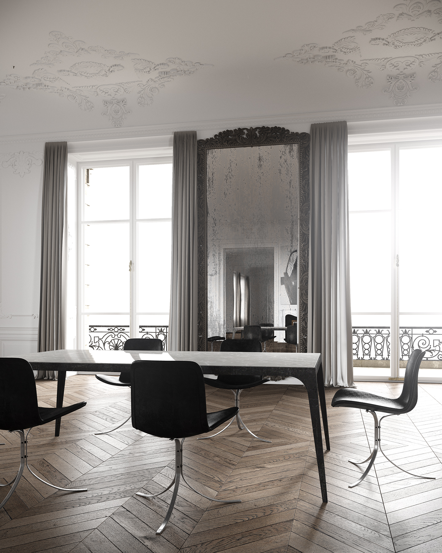
The checkerboard pattern can be seen on black leather chair on right.


On second note, I've experienced bit more with HDCache, and it's indeed lightingly fast : ) Very nice, but for this project, I'll stick with PT+PT.
Please follow my new Instagram for latest projects, tips&tricks, short video tutorials and free models
Behance  Probably best updated portfolio of my work
lysfaere.com Please check the new stuff!

2013-06-10, 19:01:48
Reply #41

michaltimko

  • Active Users
  • **
  • Posts: 305
  • Coronaut (c)
    • View Profile
Nice render, but you can use WIP section tbh. ;)

ps : i see squared pattern on chair ? Probably strong bump ?
Coronaut!(c)2011

Supporting Corona in commercial projects since pre-alpha

2013-06-10, 19:05:26
Reply #42

Juraj

  • Active Users
  • **
  • Posts: 4765
    • View Profile
    • studio website
Nice render, but you can use WIP section tbh. ;)

ps : i see squared pattern on chair ? Probably strong bump ?

Yes, that's what I asked, but I use quite lowish number, never higher than 0.02 (I hope is equal to 2 in Vray numbers). Whad do you think about filtering ?

You might be right about the WIP, didn't occured to me it's here. Usually no one uses it, but now I see it's up higher from this section Well.. . I think I'll stop now and just finish the project as is :- ). Cheers
« Last Edit: 2013-06-10, 19:08:39 by Juraj_Talcik »
Please follow my new Instagram for latest projects, tips&tricks, short video tutorials and free models
Behance  Probably best updated portfolio of my work
lysfaere.com Please check the new stuff!

2013-06-10, 19:09:20
Reply #43

michaltimko

  • Active Users
  • **
  • Posts: 305
  • Coronaut (c)
    • View Profile
I had this "squre-noise-pattern" issue on some models from designconnected. I didnt realise why its there and how i should remove it.
Try to switch off bump and check, if its there. It might be bug related to geometry.
Coronaut!(c)2011

Supporting Corona in commercial projects since pre-alpha

2013-06-10, 19:13:29
Reply #44

Juraj

  • Active Users
  • **
  • Posts: 4765
    • View Profile
    • studio website
Good you mention that, because that chair is from DesignConnected :- ) and it doesn't exactly has amazing UVWs. Funny thing is, even at same image, it doesn't show from all angles, it started happening randomly. Reading some advice here, I switched the material to filtering on, with Summer Area. But I also changed bitmap....so not exactly debug process :- ( But no time for that now..
Please follow my new Instagram for latest projects, tips&tricks, short video tutorials and free models
Behance  Probably best updated portfolio of my work
lysfaere.com Please check the new stuff!