28
« on: 2014-10-20, 00:47:45 »
johnymrazko, hi!
The first picture in the first post - it is good
hobbit - very cool
post # 11:
The size tiling - it is bad, bump - it is bad, lowpoly objects in the foreground - it is very bad
post # 21:
As a whole it is normal, but proportions are broken.
post # 24:
Presence of the person breaks proportions.
render - has not completed light, the picture is perceived by the flat.
post # 25:
The first 2 pictures - it is very bad, it not Corona Renderer is Scanline ((
Light is not adjusted, on walls - all worsens wall-paper even more, lowpoly objects, materials - are left unfinished
Last pictures - it is better (but it is necessary to work more)
post # 26:
The first 3 pictures - very much all is confused! The eye does not know where to look. Cacophony of structures, colour and forms.
The design should be thought over, instead of a warehouse of all objects which you have.
The bedroom - looks better, but huge fixtures and a bed - not for this premise
Children's room - bad colour and a material on furniture
Light - it is good
The corridor and kitchen look even better, but it is necessary to correct textures on a door and a table.
Bathroom - it is good!
The last 2 pictures - are good!
post # 32:
that's good! background texture - it is bad, it is beaten out from all.
post # 33:
Sheep - what for???))
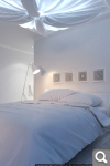
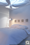
post # 36:
Well! But it is empty, the design is necessary for finishing.
violet - it beautiful, but difficult, it needs to be used with mind.
It needs to be supported something.
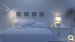
post # 38:
good!
Yellow walls support violet and point lighting have recovered a picture
post # 39:
good!
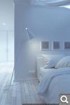
post # 47:
I do not like design!
violet and green - here are inappropriate
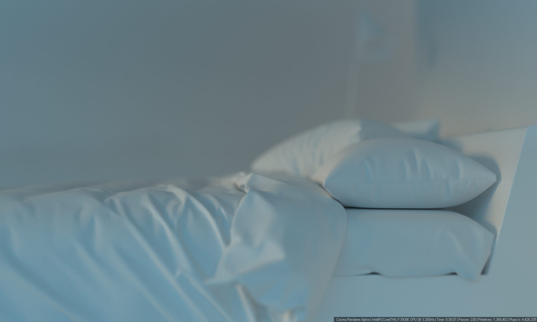
texture on curtains and a bed - it is bad, design from 1980 (as at the grandmother)
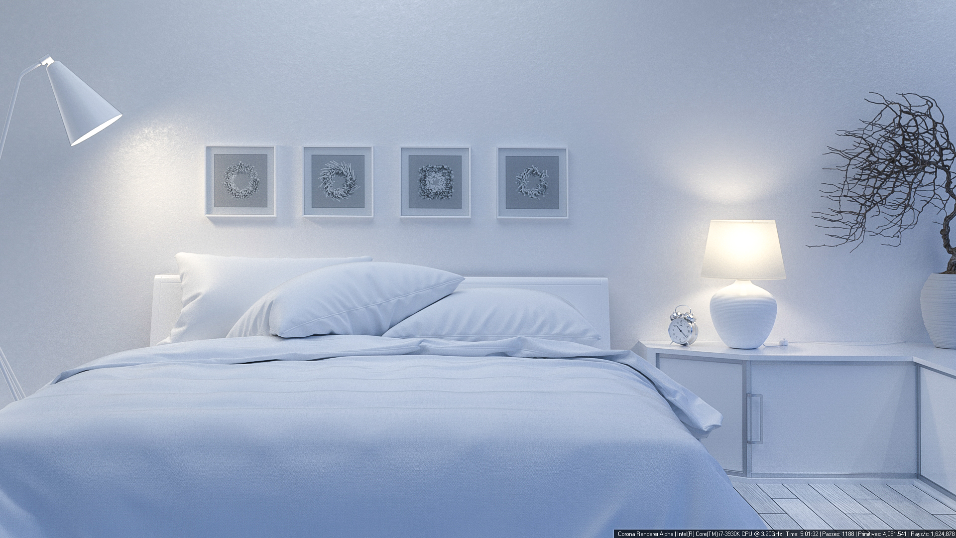
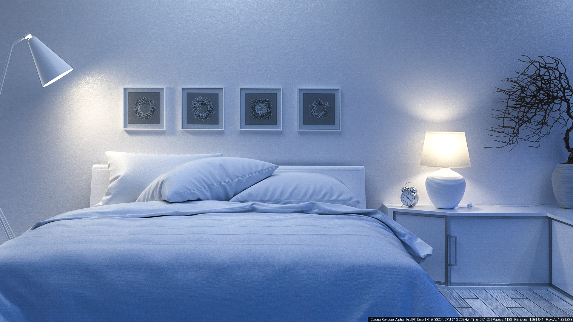
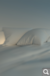
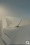
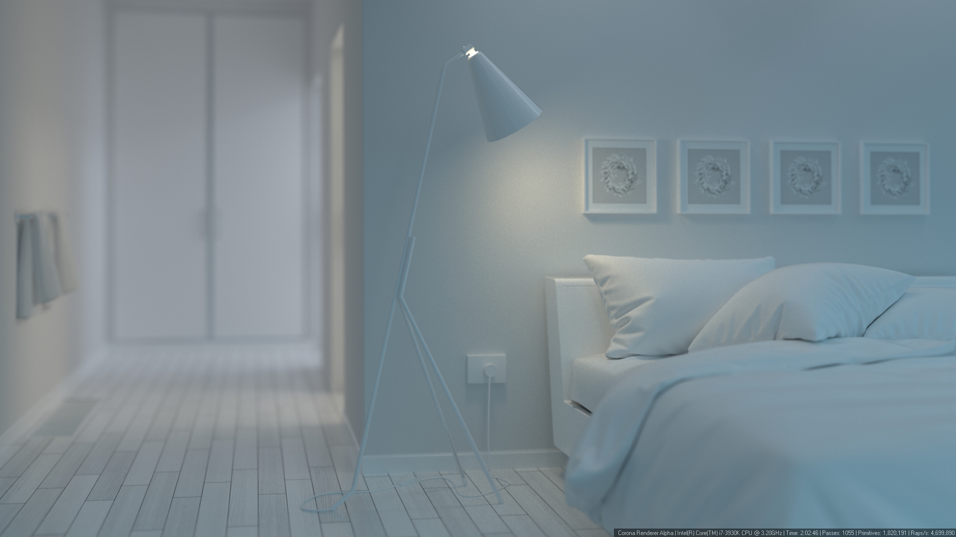
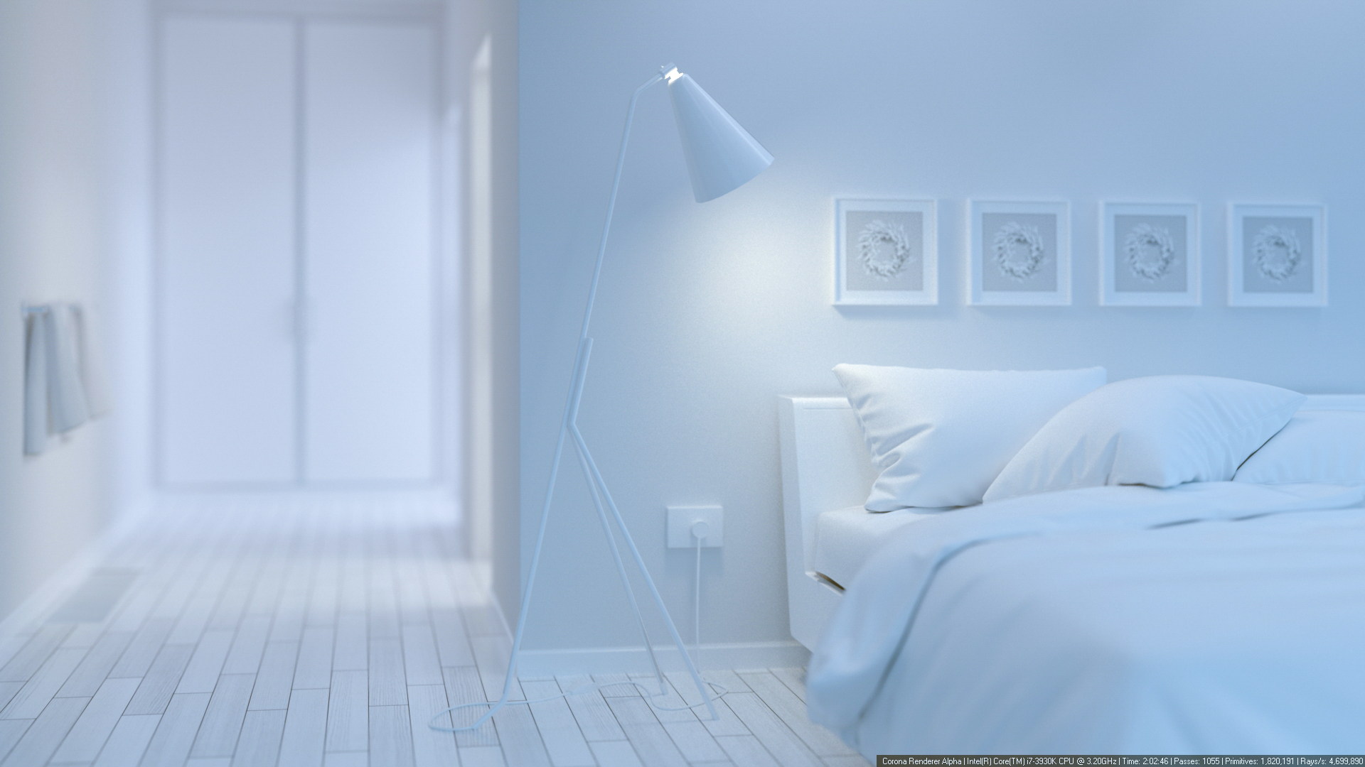
The lamp over a bed - what for to do fake? What for it is included, if it does not shine?
Corona it not Vray!
On last picture, violet has support by light from a window, on it the picture looks better, than the first.
As a whole progress is visible!
It is necessary to study in design, especially uses of colour and textures.
johnymrazko, I hope you have not offended.
I have seen appreciable errors and have specified in them, I hope it to you will help.
Good luck to you and beautiful renders!
Sorry for my English!