Show Posts

This section allows you to view all posts made by this member. Note that you can only see posts made in areas you currently have access to.


Messages - vicnaum

Pages: [1] 2 3 ... 5
1
Gallery / Re: Ocean
« on: 2017-09-24, 16:35:02 »
At least that texture worked :)

2
Gallery / Re: Ocean
« on: 2017-09-22, 09:23:38 »
Just one thing that disturb me, is that boat is still, it should swing a little bit on a water.

Don't remember, maybe it actually swings, but very little :)

3
Gallery / Re: Ocean
« on: 2017-09-21, 22:17:18 »
HI

im working on a cruise ship project  ... could i grab the Texture from you  .. i would pay for it

It's not a bitmap. That's a procedural "texture" from ChaosGroup PhoenixFD:
https://docs.chaosgroup.com/display/PHX3MAX/Ocean+Texture+%7C+PhoenixFDOceanTex

You should buy Phoenix FD plugin to get it.

4
[Max] I need help! / Re: Understanding SSS
« on: 2017-01-28, 19:27:35 »
Any updates on this?

5
Gallery / Re: BMW X5 Forest
« on: 2015-02-12, 10:35:37 »
Dust and volumetrics (and of course overall look & shading) is great. The only thing questionable is suspension behavior - not sure if this BMW should jump & sit so rough on every bump.

6
[Max] I need help! / Red glass problem strikes again!
« on: 2015-02-07, 10:35:21 »


The CoronaLight inside is absolutely white, (inside the red transparent LED glass).

I need it to be white in the center, as on reference pic above.

Why is it pink, and why is Green value -2? And how can I fix it?

P.S. It's solved by making the red glass not so red. But I need it red. There's something weird with the color math...

7
News / Re: New website is out
« on: 2015-01-23, 13:14:13 »
Cool

8
[Max] I need help! / Re: White dots on glossy glass + HDR
« on: 2015-01-20, 16:39:16 »
Yes, the lobes are different. But I'm more concerned about next things:
1) Individual dots still present on 500 passes, and a couple of ones on 1000 passes
2) 30% slower time for same passes count (but don't know about this - maybe current passes are "cleaner"?)
3) Do we really need 1000 passes to get a clean glossy without dots?
4) Even on 1000 passes it's still noisy: http://www.naumik.com/temp/scr5/20150120-3in-34kb.jpg

UPD: to make it fair - I did the same test with non-GGX legacy mode on latest 19.01 build - yes, it looks the same now, just 20% longer. And glossy value 0.6 -> became 0.73 to look similar:
https://www.dropbox.com/s/egdeb3a6nvkk962/daily_19.01_nonggx.psd?dl=0

9
[Max] I need help! / Re: White dots on glossy glass + HDR
« on: 2015-01-20, 15:10:45 »
Here I did a comparison of A7.2 and the latest Daily 19.01.2014 (look at the gif in attachment)

The A7.2 doesn't have GGX, thus there is a visual difference with the daily. But anyways - daily reflections look far too more noisy, and take longer time for the same amount of passes.


Here is also the PSD for those who want to examine it closely: https://www.dropbox.com/s/748tpwj3limydh1/a7.2_19.01_comparison.psd

10
Yeah, I'm trying to say exactly that. We now have a parameter called VALUE which acts as a saturation, and gives dull saturation on low values, and oversaturated colors on high values.

Btw, SATURATION effect is even funnier:


It does a HUE shift! Lowering the SATURATION does a hue shift towards base color (in this case - red), removing the yellow parts.

Will be funny, if the HUE control will animate the launch of statue to the moon :)

P.S. Vray isn't better - it's even worse. If a color is having 255 VALUE in Vray - it will NEVER turn into black, no matter how thick is the object, or how much the fog multiplier is - it's just becomes pure solid red (e.g. in this example). And also vray has this "magic number" fog multiplier. I really like corona having a distance. But I'd like it to have more physically correct and intuitive absorption system of controls.

11
@vicnaum
What is your usual render engine?

How does this works with that engine?
Can you post the same test?

I say that because I don't understand your way of thinking about colors as three separated values, I think this is an overcomplicated way of thinking but maybe is useful in some scenarios, so I would like to see what are you used to see in your other render engine :)

My usual render is Corona. Before I used vray (a couple of years ago).

Let me explain that way of thinking. Just answer this question:
When you set up the CoronaLights colors, do you always use BRIGHT COLORS, or maybe sometimes you use DARK COLORS too?
In the CoronaLight color picker.

12
Okay, let me give a more picturesque example:


You see, how VALUE works as saturation?
(and also reminding vray Bias control)

13
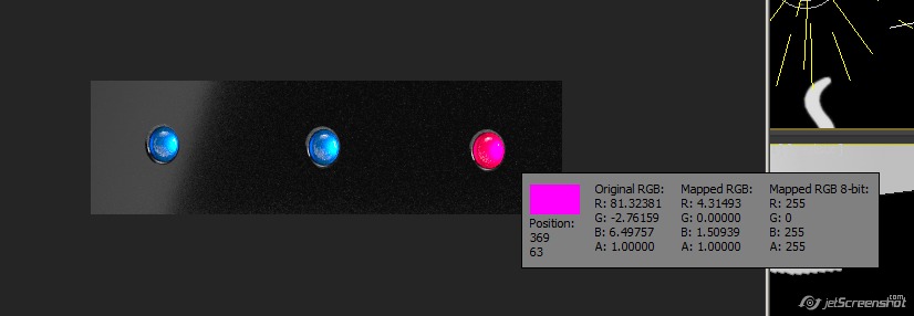
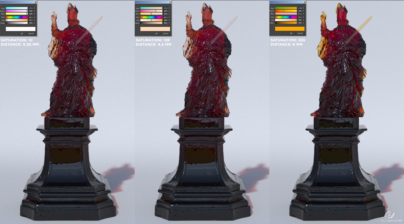
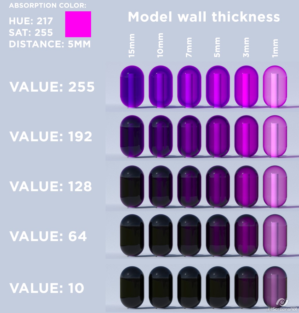
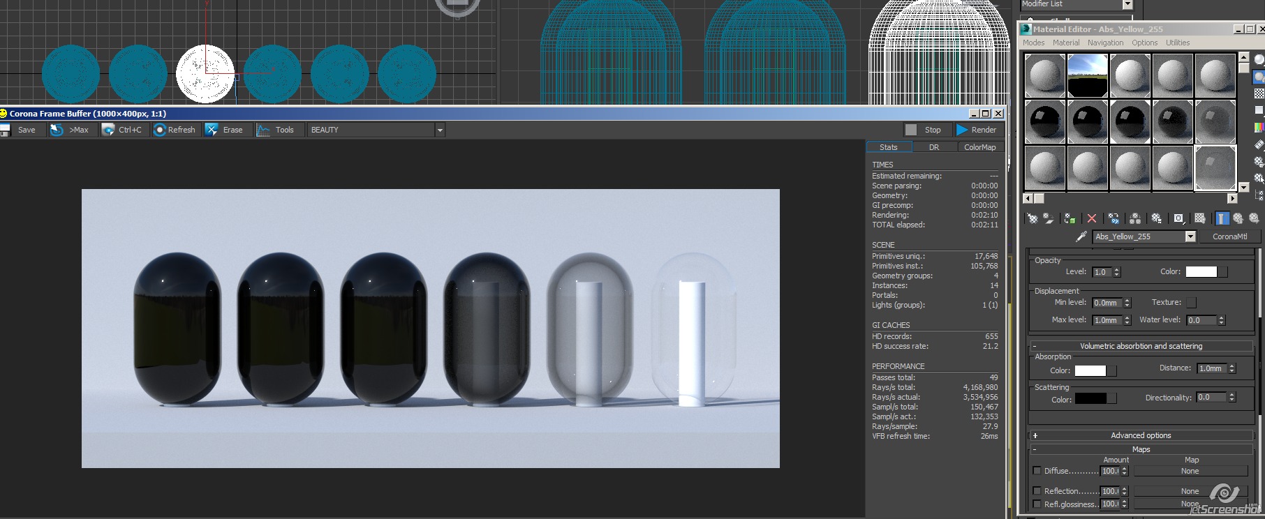
The measurements of the model wall thickness are written above it, please check. The distance is 5mm.

The sun&sky affection isn't so strong, but giving more natural looking results - on sterile tests you can be fooled more easily.

I completely understand how absorption distance falloff works, and that thicker walls should be darker, etc etc.

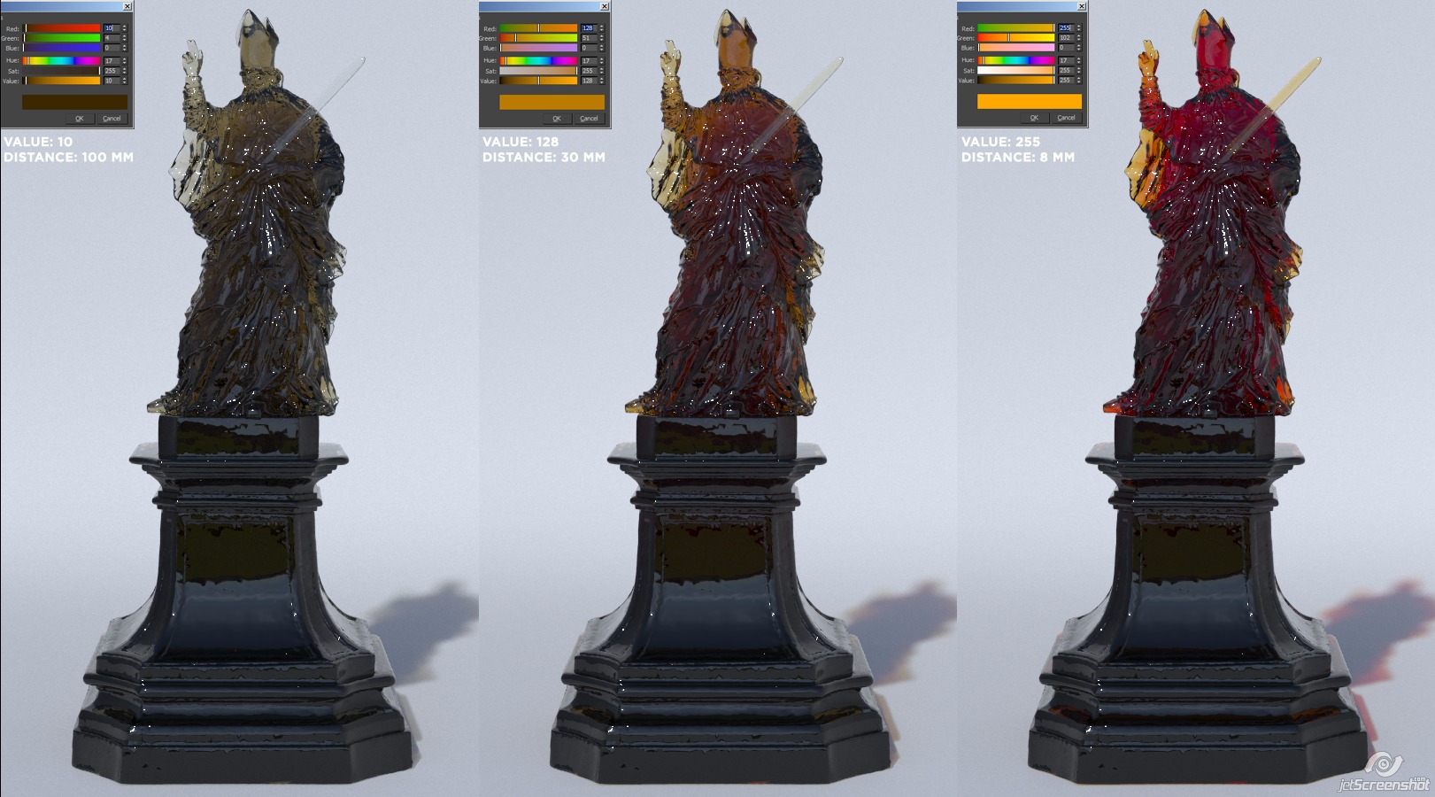
What I want to emphasize is that I can't get _predictable_ results - on 255 values I get a strong blue tint without going into the black even if the wall thickness is 15mm, and we have two walls there on that cylinder = 30mm - but we still get deep blue instead of black.

Values of 192 or 128 are more predictable - because now we get black on very thick objects, while still retaining the COLOR on 1mm thickness (although it's more desaturated).

And on very dark values, like 10 - we get black everywhere, with a slight tint of color on thin walls - if I make it even more thin (0.1mm) - then I'll get a very faded and desaturated color.

If you look at my table from top to bottom, how different VALUES affect the absorption - for example, on 1mm thickness - you'll see that the transparency isn't much changing, but just the color becomes more faded/desaturated, dirty, and dark.
Or on 5mm thickness (which is equal to 5mm distance in material) - you can see a blue "halo" around on 255 value, which becomes a strong dark substance on lower values.
Or on 15mm - 255 value has very saturated blues.

But most of all - please compare value 255 on 15mm, and value 10 on 1mm - they're very different.

So the VALUE != doesn't equal DISTANCE. It's another control, which lives on it's own, and does the similar, but completely different thing.


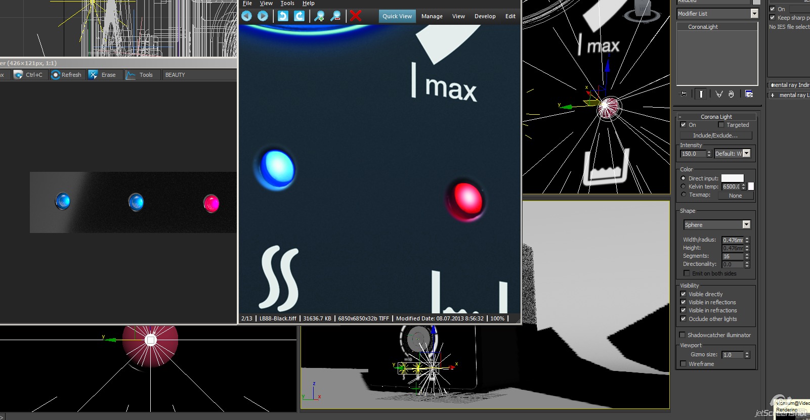
It's like the CoronaLights - you can set a color there, and there is value also - you can set a light to 10,2,8 RGB - muddy pink. But why? You have the intensity to control the brightness of the light. But what's most important - wise people added the Temperature to Lights - when you can control just the HUE, because you already have the Intensity control.

Imagine that you should set the Light color, light color brightness (which works completely different than Intensity), and light Intensity again - isn't this "artistic hell"?

But in material absorption - there is no Temperature, HUE, or whatever. There is just color. And you should pick this color brightness by eye, and pick the distance by eye again (which should control a similar thing, but a bit different). And that drives my mind crazy.

14
Did another test. Now I fixed the Distance to 5mm, and changed the VALUE on different models with different wall thickness:


As you can see, values like 255 or 10 give very strange results. So you should keep somewhere in-between...

15
Ah, that's a surprise!

Hm... It looks that we can't get a white fog then?


Because white absorption is completely transparent, and a bit grayer is just getting black.

UPD: Ah, sorry. Forgot about Scattering. Well, yes, if you set it to WHITE, then you can get a white fog:


That adds a fifth unknown to the equation.

I assume the correct whiteness is the default 128, cause there's absolutely no point in setting it to 255 (lack of absorption).

Pages: [1] 2 3 ... 5